Showcase and Casestudy: Query the Realm of 3D
Showcase and casestudy of 2023 tech leaping forward in 2024
Query the Realm of 3D
Click here for part two and here for part three of Query the Realm of 3D...
 Source: Ikea's Kreativ Hero Header
Introduction
Today I want to take you through a journey looking at Ikea's Kreativ Room / Space Designers. This exploration isn't just about analyzing an application; it's a journey through the seamless fusion of technology and design, a narrative of how virtual realms can enhance our physical spaces.
A detailed case study of the Ikea Kreativ Room Designer. This exploration isn't just about analyzing an application; it's a journey through the seamless fusion of technology and design, a narrative of how virtual realms can enhance our physical spaces.
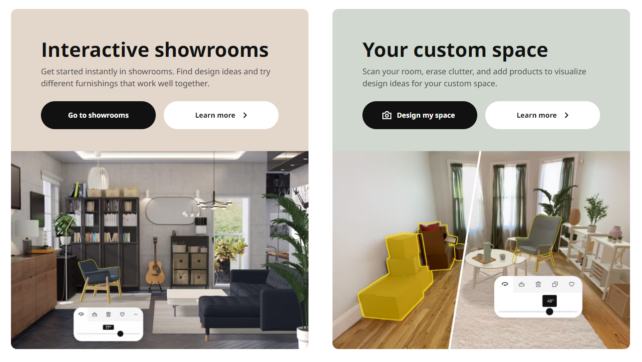
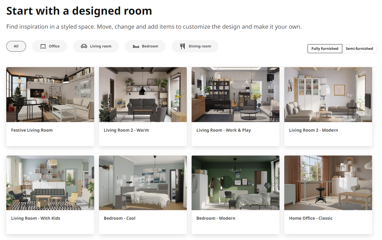
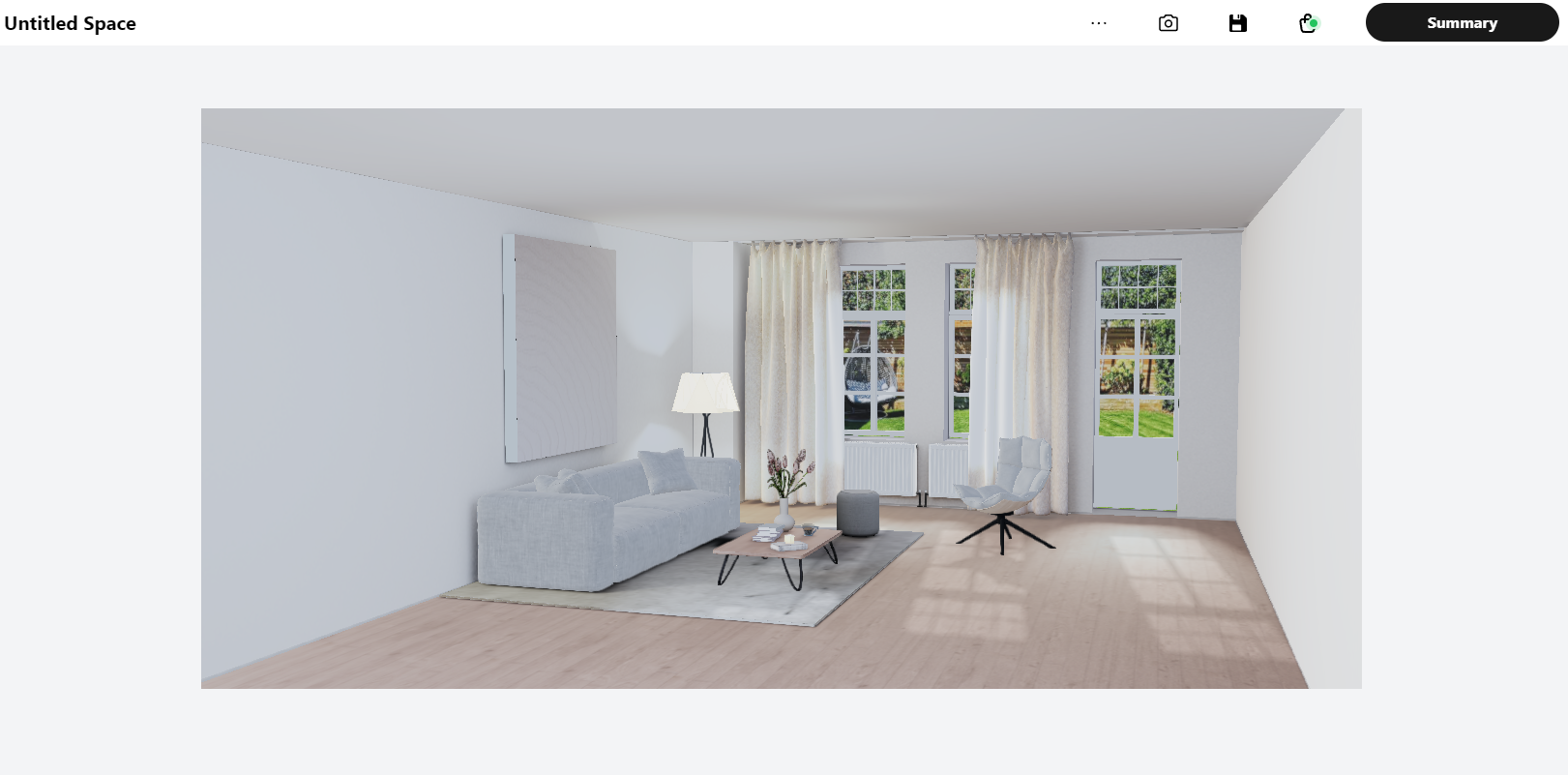
Starting with the provided blank slate empty rooms and the pre-designed rooms. The Kreativ Room Designer is prominently featured, inviting users with its visually appealing graphics and a clear call-to-action. A simple click leads you into the realm of virtual design.
As the platform loads, you're transported into a digital space that feels both familiar and revolutionary. The interface is sleek and uncluttered, making it easy for users to focus on the task at hand – designing their dream space. The platform operates smoothly across a range of devices, whether you're on a desktop computer, a tablet, or a smartphone, ensuring a consistent experience.
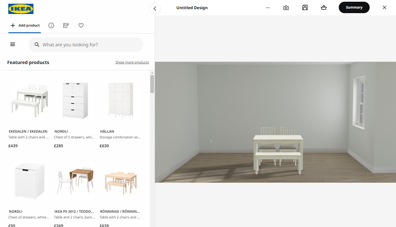
At the heart of the Room Designer is a powerful yet user-friendly set of design tools.
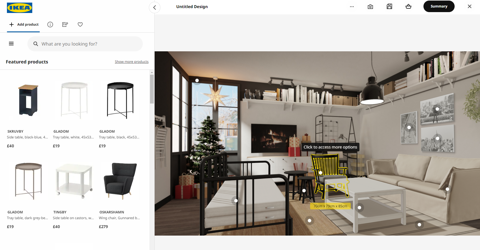
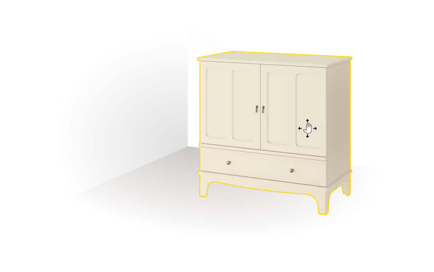
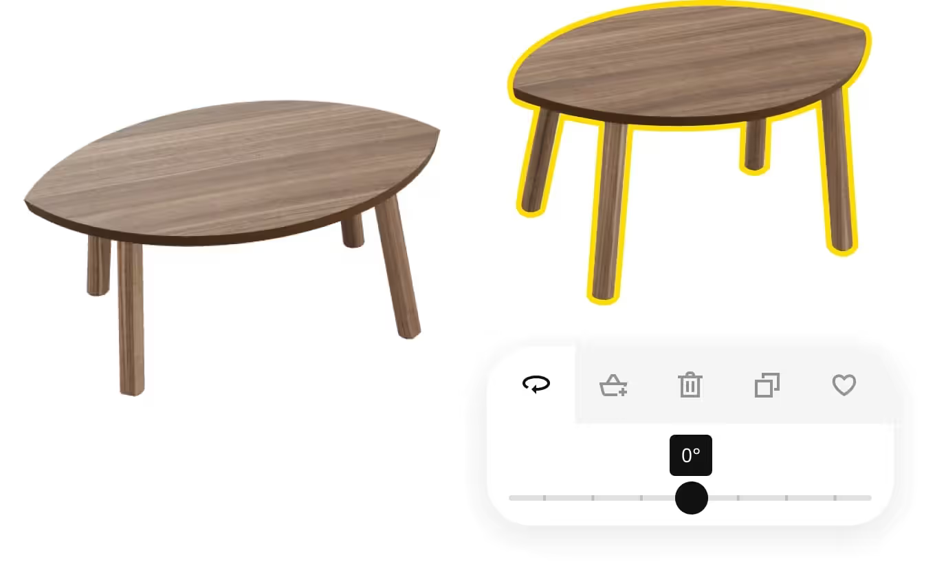
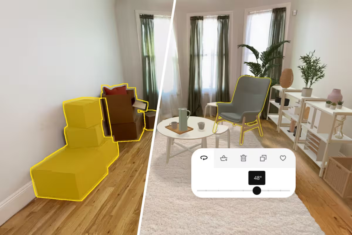
Hovering over non-interactable area's activates a unique layer that marks furniture with dots, an effective feature for immediately understanding the provided functionality. This design aspect serves as a user-friendly tool for quick adaptation to the technology. The swifter a customer or user can personalize their experience, the more rapidly they develop an emotional and instinctive (even impulsive) connection with the product. From a designer's perspective, this is crucial in forging captivating experiences that attract. However, if one element is underutilized or overemphasized, it can disrupt the entire user experience, which is undesirable.
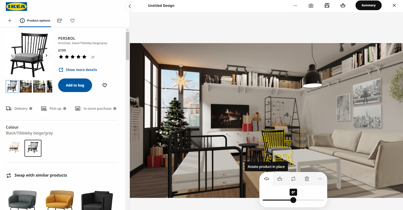
When you select and click on a piece of furniture, an intuitive context panel appears. This panel enables you to rotate the piece of furniture, add it to your cart, or remove and replace it. Keeping it simplistic, as it should be. The sidebar plays a pivotal role as it acts like an 'assistant' panel. Here, you can peruse the furniture catalog, modify product colors, gather more information about a product, and explore similar alternatives.
Overall, the user interface (UI) is visually appealing. The main canvas maintains a 16:9 video aspect ratio, while the sidebar emerges for smart and efficient use of screen space without cluttering.
The platform basically enables the user to design, plan and buy entire new rooms at a time using your own available space as a base (when using the iOS app). Which to me is a big step forward in the right direction as a giant like Ikea and it's Kreativ division. Pushing innovation, trying to push the boundaries of web innovation using classic tricks from the 3D industry. I love every bit about it.
Once satisfied, users can even save their designs or share them with friends, family, or professional consultants for feedback. This collaborative aspect of the platform adds another dimension to the design process, making it more interactive and enjoyable.
Their iOS work is also something else... more on this down the article.
Source: Ikea Kreativ Learn More Section
Shifting focus from the UI
To a more technical perspective:
First: You might be wondering, how does Ikea create such a captivating effect?
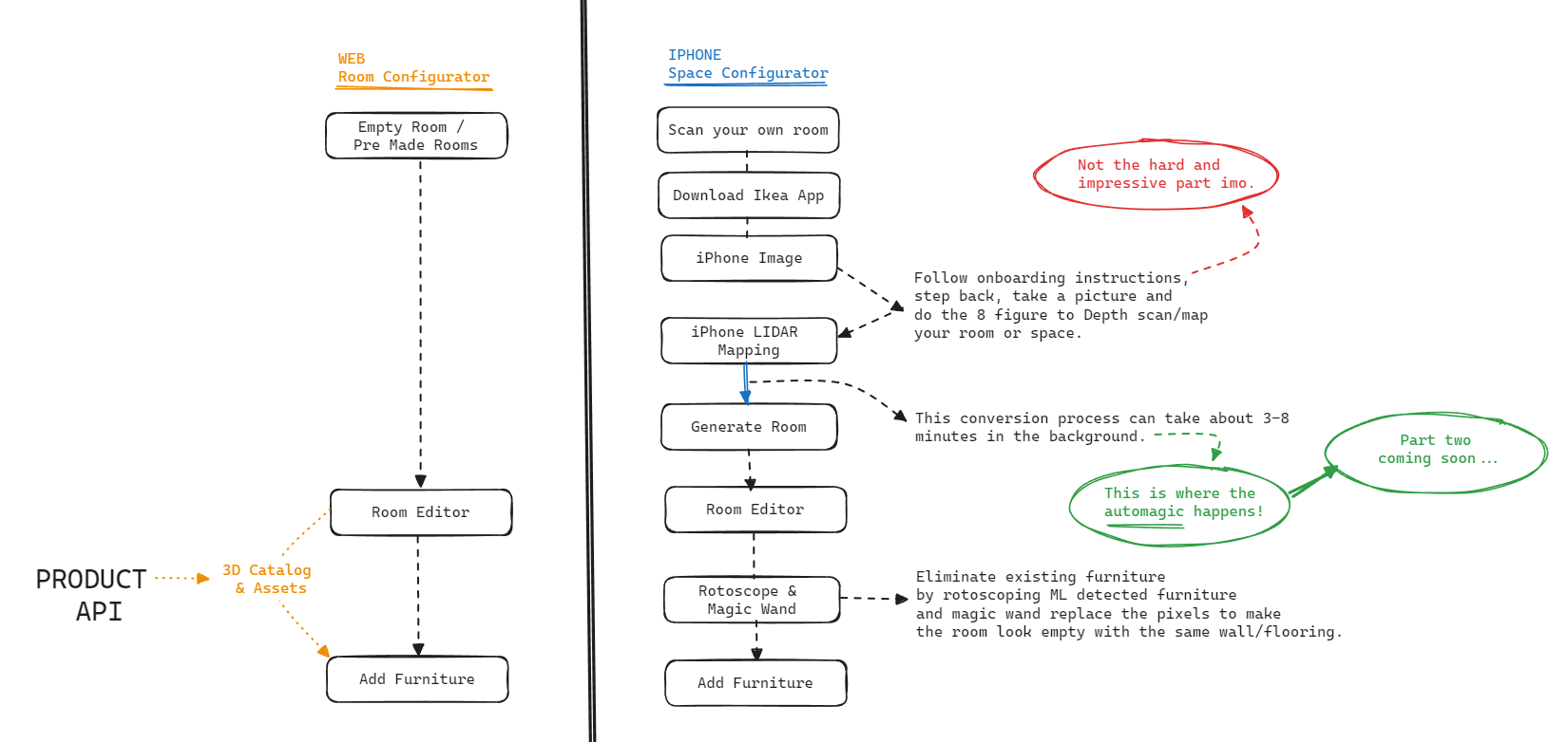
Let's break down the web-based room/space planner and its iOS equivalent into (over)simplified steps.
The web configurator is relatively straightforward, employing no new technologies.
Three.js stands as the core 3D engine for most web-based 3D applications.
Second: How does a seemingly flat image contain 3D data, almost like a magical layer straight out of a Harry Potter movie?
Let's delve into a method I used in my MVP replica to recreate the Kreativ Room Designer:
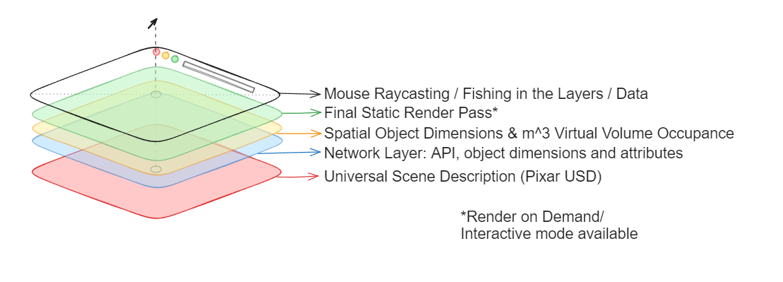
The above image reveals the concealed stack of layers in the image/canvas.
As the mouse moves over the image (on the HTML canvas), it casts a line straight down like a fishing rod. The first object this line encounters is brought to the forefront, complete with all its relevant details such as spatial dimensions, product price, and options to add them to the shopping cart. This concept forms the core of the design. It's not a new idea but rather a creative approach to problem-solving, enhancing the customer experience overall. A commendable effort by the team at Ikea Kreativ!
Below are some images from the 'learn more' page of Ikea Kreativ depicting the furniture outline on mouse hover and context menu.
Let's zoom out to a broader perspective. Essentially, what's happening is a reimagining of the JPEG format in a browser. You may think you're viewing a 2D image, but that's an expertly crafted illusion. In reality, you're seeing a render of a static, photorealistic 3D scene, similar to the one shown below.
Source: Three.js Showcase
Leveraging Three.js as the foundational canvas, you can enable users to interact with 3D elements within an image that blends together and appears 2D.
Ikea's scene and camera, however remain static; they don't move or pan compared to the provided showcase. This consistency is vital because if the 3D base moves, it could disrupt the fourth wall and affect the overall user experience and level of user immersion. I (personally as a customer) see Ikea as a brand that designs products that everybody understands, universally, you can see and feel this reflect back in the elegance of their Kreativ platform.
You might be curious how I know all this. The answer is simple: I've built a replica with Nuxt, just for your comfort.
Just kidding with the Idea logo. I'm however not kidding about having built a MVP replica showcase model in under two weeks... Han solo. Backfed with product data and GLB assets over API.
Showcase Demo
The showcase demo replica I prepared relies on a framework called Nuxt 3 together with Three.js, the go to javascript library for all your 3D web applications.
Here's a early preview of my showcase variant in a earlier rapid prototyping developmental state. I utilized a pre-made baked 3D room from PixReady for the first room as the foundation, then used a second model from sketchfab. These rooms have sufficient visual quality to effectively demonstrate the concept. Achieving more impressive results is possible by employing higher-quality photorealistic baked scenes, similar to those used by Ikea in their productions.
In my opinion, Ikea Kreativ is a brilliantly crafted and visually stunning piece, seamlessly merging various technological landscapes. From a technical standpoint, there are several approaches and workflows to achieve Ikea-like results:
- 1. Utilizing photorealistic baked 3D rooms.
- 2. Using a static camera to project photorealistic baked textures onto simple geometry (like the base room geometry). Each method has its pros and cons, balancing utility, performance, and visual appeal, making every 3D web project or integration a unique challenge – something I personally relish.
Let's explore some key technical challenges: (I'm assuming they had to go through this as I did when going for the Three.js route)
- 1. Creating and managing photorealistic baked 3D scenes coming from software like 3D Studio Max, Cinema 4D, Blender, or others exported to a workable GLB/GLTF format. These files are either from third party modeling agencies or done in house and if 'lucky' based of pre-existing CAD drawings. (Already having CAD files of your products is a huge W if you want to do something similar like Ikea, otherwise a major cost that in worst case might need outsourcing.)
- 2. Bridging the gap between web developers and 3D animators or game developers. Web developers who often lack core fundamental knowledge of existing 3D industry asset pipelines and workflows, increasing cost projections and delivery times without specialized 3D render engine tooling and web integration expertise.
- 3. Integrating digital twin furniture in real-time web sessions, ensuring proper updates, collision handling and distance/measurement accuracy.
- 4. Avoiding furniture misplacement during load or movement.
- 5. Managing room states and multiple rooms within a dashboard-like ERP/CMS customer panel.
- 6. Addressing performance issues across various devices, noting Safari's limitations in WebGL tasks, and the potential improvements with WebGPU.
- 7. Efficiently storing and retrieving a 3D furniture catalog that is accurate and real-world reflective.
Note: GLB/GLTF is primarily used for transporting 3D assets. I launched GLTransform.com for real-time GLB/GLTF conversion to Apple Pixar USD format for augmented reality exports, and I'm working on Coding Engine, a platform similar to Vectary, for managing and publishing 3D digital twins. As a secure source of 3D assets over URL/CDN when wanting to add them to your rooms.
I hold immense respect for Ikea's designers, especially for their web design and the functionality they've incorporated into the Ikea brand. It resonates with my preference for minimalism and a 'less is more' approach, while still offering a rich user experience throughout the Ikea journey.
While creating the replica, I paid close attention to the many thoughtful details, a practice I always advocate myself too.
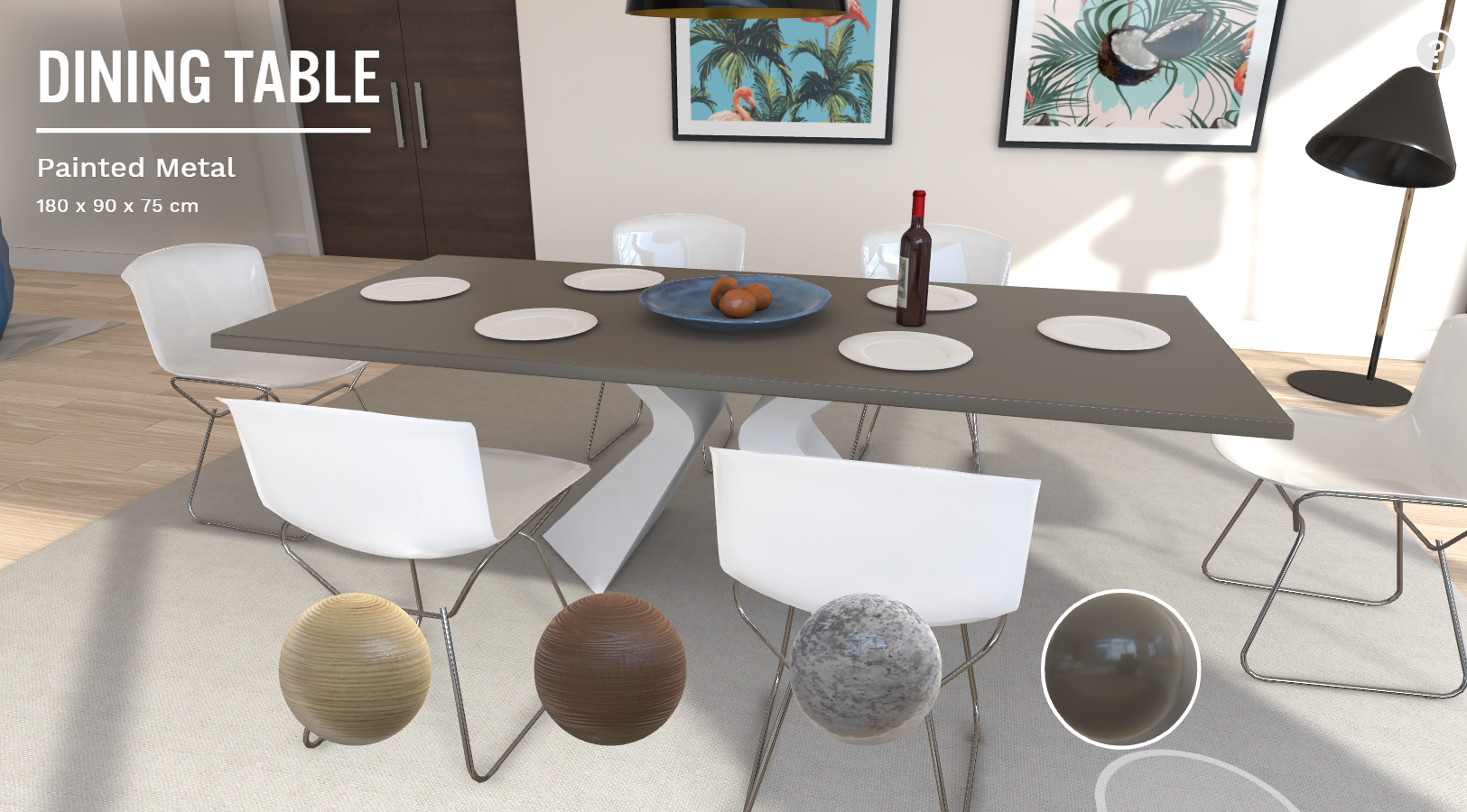
- 1. Additional summary information displayed on hover.

- 2. Another example of the above mentioned additional information on product hover, the product description unfolds over the price including dimension information of the product.
- And even more attention went into the orange dimension labels underneath furniture: Ikea Kreativ first, replica in the second video.
- An additional feature Ikea implemented involves wireframe box loaders that scale from 0 to 100 within a regular box, signaling the loading of furniture into the scene. This box is designed to match the real-world dimensions of the furniture, ensuring that customers get an accurate representation of what they are purchasing.
Developing a clever label positioning system was crucial to keep these labels within the confines of the 'image/canvas'. Allowing them to stray outside would have caused an additional vertical scrollbar to appear. To enhance the visual appeal according to my personal preference, I allowed some minimum padding space between the bottom edge of the canvas and the orange product labels in comparison to that of Ikea's.
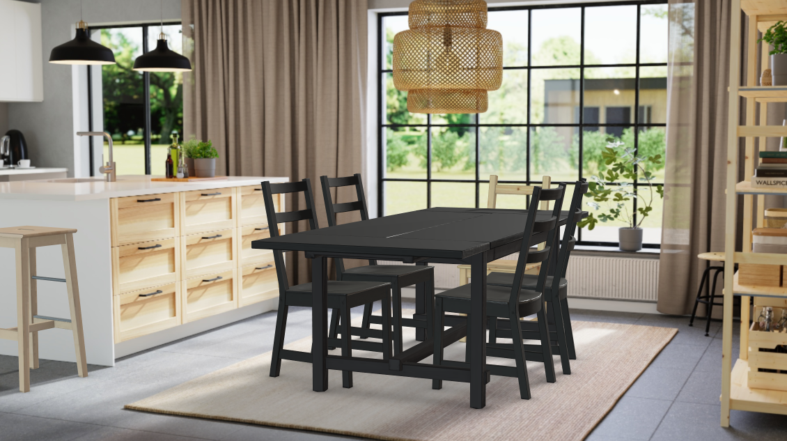
Here is an example of Ikea's visual standard, which is not difficult to replicate:
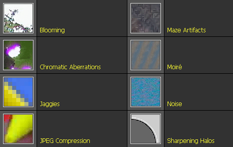
The integration of lighting and shadowing in the design is clever, though not flawless. The room's base texture includes pre-baked shadows, and the window acts as a light source, casting shadows while using the HDR map of the actual room to illuminate the furniture. This overlapping of shadows creates a cohesive visual effect. However, it's evident that they decided against using a post-processing pass to introduce video artifacts on the imported furniture, which is noticeable when comparing the kitchen sink to the black furniture table. The difference breaks the fourth wall, as the imported furniture appears too 'clean' compared to the natural compression, moiré, and anti-aliasing effects typically seen in real camera captures.
To illustrate what I mean by 'artifacting': Artifacts are pixel scanline errors that occur when a camera fails to accurately capture certain patterns, like blocked or striped shirts. The black table in the above example looks artificial because it lacks these common artifacts, whereas everything surrounding the table shows signs of them. The cheaper you go on the imaging sensor, usually, the worse it gets. So if you have low quality video footage, you will most likely need to increase the amount of 'video noise/dirt/smudge' on top of the digital twin to properly blend them. The human eye's are programmed to distinguish fake from real as a threat detection mechanism from the early days. As a designer you need to incorporate all the variables... to get 'true' believable realistic results.
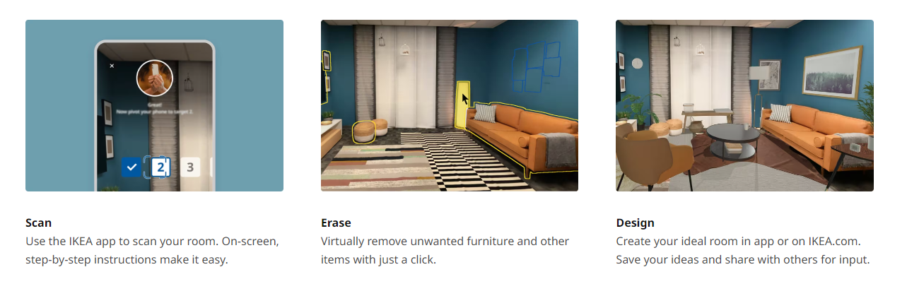
The iOS app of Ikea does something similar, it's called rotoscoping. A video editing process where you cut out parts/sections of an image with a mask and replace the masked content, effectively erasing 'furniture' that used to be there.
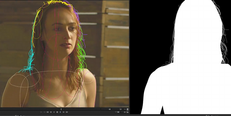
This level of artistic vision, and eye for detail is typically mastered by AD's/TD's (Art- & Technical directors), technical cameramen, VFX artists and Rotoscope specialists in the Hollywood film/animation business. Besides realism it's also a matter of a directors iconic taste. It's unrealistic to expect web developers to possess such nuanced understanding of user experience and video processing, much less to construct and include this level of detail in a fully functional SaaS platform. I've witnessed some daunting challenges at companies attempting to undertake these complex projects.
I understand quite well why avoiding this level of detail (perfectionism/ over-engineering) might be preferable, especially when using Three.js. Implementing post-processing with the composer significantly increases performance costs in increased draw calls, as it involves rendering not only the same image multiple times but also the under the hood supporting-logic. A more efficient approach is to render only when necessary, such as when a user moves or adds furniture. I like to call this a 'Render on Demand' feature, which is crucial to avoid draining the user's battery due to non-stop heavy client-side processing and potential memory leaks.
In conclusion, the Ikea Kreativ app surpasses other offerings in its category. It's a solid starting point with plenty of room for growth and improvement in the realm of bringing space planning directly into the hands of customers.
What's next? Of course, part two!
In part two, we will be going over the surface of the iOS side of things, exploring a similar ML model that can detect and remove existing objects from your image.
This all will lead to creating realtime AI- powered and including partially driven apps for the Apple Vision Pro, the Oculus Quest 3 and the Emotiv EEG Brainwave headset in the near future.
Excited and can't wait for even more insight?
If you are interested in building something similar like Ikea's room planner including even more advanced AI and Machine Learning integrations, feel free to plan in a consultation with me with a live demonstration to find the best matching possibilities that suit your business use case. Now has never been a better time to innovate your business.
The Future of Space Planners - Part Three
Showcase and casestudy of 2023 tech leaping forward in 2024, focusing on AI Diffusion InPainting and automating the rotoscopy process.
Nuxt Experimental Features: Connect your Turso DB natively with db0 and Drizzle ORM
Explore the enhanced developer experience in Nuxt's nightly build, showcasing improved database setup in Nuxt projects using db0 and Drizzle ORM.